
Responsive image on jekyll
Responsive image make your website faster by loading the image that is required for the screen. Loading high quality image in every screen size is not optimal. Also showing a low quality blur version of the image while the real image is loading also improve the readability.
Installation
jekyll-responsive-image plugin
First, add -
gem 'jekyll-responsive-image'
to your Gemfile.
Then add it to the plugins section of your _config.yml:
...
plugins:
  - jekyll-paginate
  - jekyll-sitemap
  - jekyll-gist
  - jekyll-feed
  - jemoji
  - jekyll-archives
  - jekyll-responsive-image
...
Last, install the plugin by running
bundle install
Please Note: If there is an error while installing the plugin plese run sudo apt-get install libmagickwand-dev to install required library and try again. And if you are on windows follow this step How To Install The RMagick #RubyOnRails Gem on Windows 7 / 8 / 10 (ImageMagick 6.9.4 Q16-HDRI)
Configuration
_config.yml file
Add those lines to the end of your _config.yml file-
# Responsive images
responsive_image:
  # [Required]
  # Path to the image template.
  template: _includes/responsive-image.html

  # [Optional, Default: 85]
  # Quality to use when resizing images.
  default_quality: 90

  # [Optional, Default: []]
  # An array of resize configuration objects. Each object must contain at least
  # a `width` value.
  sizes:
    - width: 20 # lq
      quality: 10
    - width: 480  # [Required] How wide the resized image will be.
      quality: 80 # [Optional] Overrides default_quality for this size.
    - width: 800
    - width: 1400
      quality: 90

  # [Optional, Default: false]
  # Rotate resized images depending on their EXIF rotation attribute. Useful for
  # working with JPGs directly from digital cameras and smartphones
  auto_rotate: false

  # [Optional, Default: assets]
  # The base directory where assets are stored. This is used to determine the
  # `dirname` value in `output_path_format` below.
  base_path: assets/images

  # [Optional, Default: assets/resized/%{filename}-%{width}x%{height}.%{extension}]
  # The template used when generating filenames for resized images. Must be a
  # relative path.
  #
  # Parameters available are:
  #   %{dirname}     Directory of the file relative to `base_path` (assets/sub/dir/some-file.jpg => sub/dir)
  #   %{basename}    Basename of the file (assets/some-file.jpg => some-file.jpg)
  #   %{filename}    Basename without the extension (assets/some-file.jpg => some-file)
  #   %{extension}   Extension of the file (assets/some-file.jpg => jpg)
  #   %{width}       Width of the resized image
  #   %{height}      Height of the resized image
  #
  output_path_format: assets/images/resized/%{width}/%{basename}

  # [Optional, Default: true]
  # Whether or not to save the generated assets into the source folder.
  save_to_source: false

  # [Optional, Default: false]
  # Cache the result of {% responsive_image %} and {% responsive_image_block %}
  # tags. See the "Caching" section of the README for more information.
  cache: false

  #/ [Optional, Default: []]
  # By default, only images referenced by the responsive_image and responsive_image_block
  # tags are resized. Here you can set a list of paths or path globs to resize other
  # images. This is useful for resizing images which will be referenced from stylesheets.
  extra_images:
    - assets/foo/bar.png
    - assets/bgs/*.png
    - assets/avatars/*.{jpeg,jpg}
Create image template
Now create a responsive-image.html template file and paste the contents there-
{% capture srcset %}
{% for i in resized %}
    /{{ i.path }} {{ i.width }}w,
{% endfor %}
{% endcapture %}

{% assign smallest = resized | sort: 'width' | first %}

<img width="100%" src="/{{ smallest.path }}" alt="{{ alt }}" data-srcset="{{ srcset | strip_newlines }}" class="blur-up lazyautosizes lazyload">
Add lazysizes
You need to add lazysizes js file to your website. To do this, download the min version from here and put it to your assets/js folder and add those line to your script section depending on your theme.
<script src="{{ '/assets/js/lazysizes.min.js'| absolute_url }}"></script>
Please Note: I am using minimal mistake theme. So I added the js file in _includes>scripts.html after the main.min.js include code
CSS modification
Now add those line to your css file for blur effect for smoth image pixel
.no-js img.lazyload {
display: none;
}

.blur-up {
filter: blur(10px);
transition: filter 400ms;
}

.blur-up.lazyloaded {
filter: blur(0);
}

.fade-in {
opacity: 0;
transition: opacity 400ms;
}

.fade-in.lazyloaded {
opacity: 1;
}
How to use
To insert image in a post use
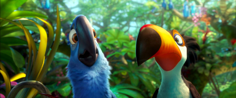
{% responsive_image path: assets/images/Rio.jpg %}
where assets/images/Rio.jpg is your image path. This will take care of everything. Now you can enjoy responsive image in your blog.
Testing
Here is a normal image-

and here is a responsive image with lazy loading enabled
Please Note: This may not work with Github Pages directly. You need to host your own jekyll site or use third party CI tool to build the site. I am using Travis ci for my blog. If you have any question feel free to ask me.
Leave a Comment